Learn the fundamentals so that you can grasp the complexity
Art is highly subjective. Additionally, beauty is in the mind of the beholder. Nonetheless, if you've ever encountered a perplexing parking sign or a website from the early 1990s, you'll be aware of the existence of terrible design.
As with any other profession, graphic design is governed by certain rules that serve to balance and harmonize the work. Understanding design concepts and their interrelationships is essential for both novice and experienced designers. Implementing them deliberately is the key to creating aesthetically beautiful and functional designs.
When I first began my career as a designer, I lacked the necessary understanding of these ideas to incorporate them into my work. However, as time passed, I became familiar with and began to comprehend what works and, more importantly, why it works.
In this post, we'll look at each concept on its own and see how they work together to help you get the right message to the right people.
1. What are the design fundamentals?
In a word, design principles are the rules, behavioral patterns, and considerations you should utilize strategically in your designs to reduce users' cognitive loads and boost their appeal. Behavioral science, sociology, ergonomics, and psychology specialists, among others, laid the framework for these design ideas. They represent the accumulated expertise of design experts and scholars.
2. How do these principles impact your design decisions?
According to design and usability expert Jared Spool, "excellent design, when executed well, is invisible. Only when it is executed poorly do we notice it. " And for this reason alone, it is impossible to describe good design.
As a designer, you must have experienced times when you're about to pull out your hair because you can't pinpoint what's wrong with your work. Design principles aid you in identifying the core values of your product so that you may make decisions that uphold their integrity throughout the design process, thereby allowing you to address this issue and many others. Moreover, if you and your team have a few sets of protocols to refer to, you will naturally have a shared vocabulary and a set of norms that you can use while collaborating.
3. Six Fundamental Design Concepts
While conducting research for this post, I discovered the book Universal Principles of Design by William Lidwell, Jill Butler, and Kritina Holden. It contains a comprehensive compilation of 125 concepts (or principles) applicable to the design process. These six, though, out of 125, I believe form the basis of a good design.
3.1 Accessibility
Typically referred to as barrier-free design.
Let's discuss the elevator in my building as an example of an accessible design. It includes broad doors that make it easy to enter; railings on both sides to provide support; and two sets of controls that are accessible from a seated position. In addition, the floor numbers are redundantly encoded using numerals, icons, and Braille, and visible and audible feedback are provided. It also has a phone system that can be used in an emergency to get help from a professional.
Using the above example as a guide, a good design for accessibility should have four qualities: it should be easy to see, easy to use, simple, and forgiving.
Perceptibility is when a design can be perceived by anyone, independent of sensory capabilities.
When a design is operable, it can be used by everyone, regardless of their physical limitations.
Simplicity is when everyone, regardless of knowledge, literacy, or level of concentration, can quickly comprehend and utilize a design.
Forgiveness is when a design minimizes the occurrence and impact of errors.
Designs must be usable by people of all abilities without requiring adjustments. Accessibility in design has always aimed to accommodate individuals with disabilities. Later on, however, it became clear that we could make several critical changes that would benefit everyone.
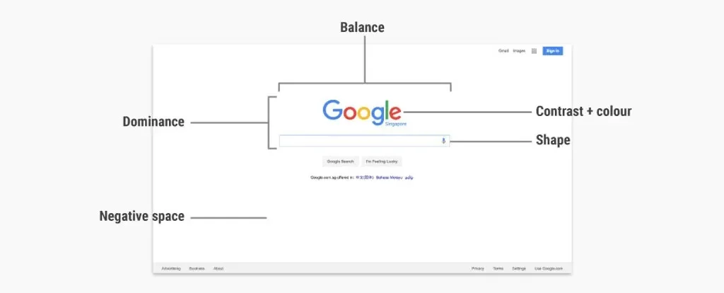
3.2 Importance
Emphasis causes certain design elements to stand out. On the other hand, it can also be used to diminish the prominence of certain elements. We employ this approach to convey information in our daily lives. Imagine a public speaker who fails to emphasize specific terms throughout a speech. The audience will be incapable of comprehending the speaker's intended message.
Similarly, focus is a design element that attracts the user's attention. In other words, it is the focal point. Whether it's a headline, an image, or a call-to-action (CTA), this should ideally be the most important design element. Inadvertently highlighting the incorrect website elements might lead to user confusion.
Users should be able to quickly locate the action or information required to perform a task. As you evaluate your user journey, you should ask, "How am I making it simple for users to fulfil their tasks?" This may require modifying the navigation of your design based on the results of any usability tests you do. If someone is having difficulty locating a crucial aspect during the study, you should discover a better way to stress it.
3.3 A white space
The remaining design principles all pertain to the components of your work. White space is the sole element that addresses explicitly what you do not contribute.
White space refers to areas in a design that are devoid of visual elements and have unused space around them. Specifically, it refers to the empty areas, places, and spots in your design. White space stresses a more direct approach to design by not contributing to the composition. Certainly, less is more.
The idea that white space must be white is widespread. Not necessarily, no. It might be any color.
3.4 Hierarchy
Hierarchy is a graphic design strategy that organizes website elements according to their importance.
You may be asking how hierarchy differs from emphasis at this point. Despite the fact that both notions are connected, hierarchy refers to a group of items arranged in order of importance. On the other hand, focus is about highlighting one element over others.
Why do we need a hierarchy? Visual hierarchy is a vital element of efficient design because without it, everything on your website will look to be of equal importance. By providing visual cues, the goal of UX design is to always make it clear to the user where to focus first and what action to take. The Hierarchy assists in directing users to the initial step of their user experience.
3.5 Contrast
When two or more design elements are close to each other, contrast makes it easy to see how different they are from each other. Despite the fact that color contrast is the first thing that comes to mind when you hear the word contrast, there are other types of contrast as well. However, you can create contrast in your designs by using varying element sizes, shapes, and other attributes.
3.6 Alignment
Alignment addresses the placement, arrangement, and organization of visual elements in relation to one another and the overall design. It is a technique for visually connecting comparable pieces to create a more unified design. Aligning visual elements assists in guiding the observer through a design.
In paragraph text, for instance, left-and right-aligned text blocks provide stronger alignment cues than center-aligned text blocks. Text blocks aligned to the left and right generate an unseen column that serves as a visual guide for the positioning of other design elements. In contrast, center-aligned text blocks provide fewer clear visual alignment cues and may be difficult to relate to other elements.
Although rows and columns are the most frequent methods of alignment, there are other, more complex methods of alignment as well. For example, when diagonally aligning items, the angles between the unseen alignment lines should be at least 30 degrees apart. Any difference less than that is too small and can't be seen.
Conclusion
When I was originally introduced to these ideas, being the rebel that I was, I wondered whether we could function without them. I believe that design is an abstract art form, and by adhering to only a few guidelines, we are limiting our vision. Time has taught me, however, that disciplined creative direction usually triumphs abstract art when usability and understanding criteria are considered. Typically, a designer's intuition and a great deal of trial and error are required to create something that is aesthetically pleasing and offers the optimum user experience.